The Retention Curve: What Your Cohort Report Reveals About PMF
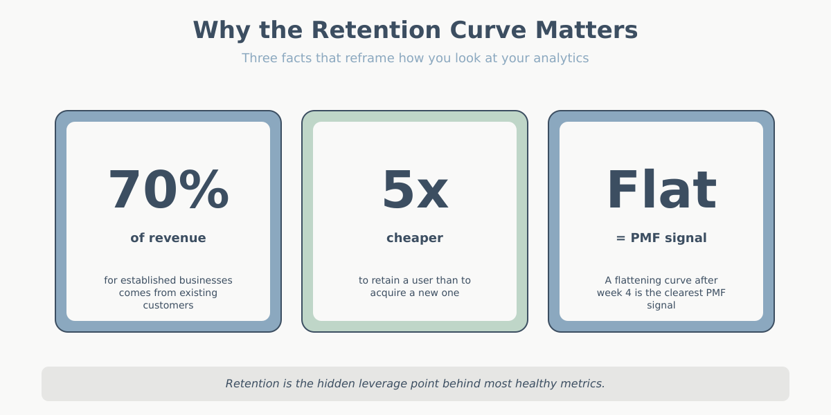
If I had to keep only one chart from my analytics stack, I would keep the retention curve. Not the traffic dashboard, not the conversion funnel, not the SEO report. The retention curve tells me whether the product works. Everything else tells me how many people showed up to try it.
Most site owners I talk to have never actually looked at one. They read averages instead: “our average session duration is 2 minutes 40 seconds”, “our bounce rate is 48%”. Those numbers are fine. They also hide the only question that matters for a business that wants to exist in two years: do people come back?
This article is about reading retention curves as a product-market fit diagnostic. Not how to build one in GA4 or Matomo — there are plenty of tutorials for that. What I want to cover is the shape of the curve, what each shape says about your product, and how to act on it. By the end you will look at a cohort report and see a story instead of a grid of percentages.
Retention curve and cohort analysis in one paragraph
A cohort is a group of users who share a starting event — usually the week they first visited or first signed up. Cohort analysis tracks that group over time instead of collapsing everyone into a single average. If 1,000 people signed up in January, we watch what those 1,000 people do in February, March, April, and so on, separately from the March cohort, the April cohort, and so on. The payoff is that you can see whether the product is getting better or worse — averages mix improving cohorts with declining ones and hide the trend. A cohort table is, essentially, the only way to tell whether this month’s improvement is real or whether you are just acquiring more traffic.
Anatomy of a retention curve
A retention curve is a simple two-dimensional chart. The x-axis is time since acquisition, usually measured in days, weeks, or months. Week 0 is the week the user first arrived. Week 1 is “one week later”. Week 12 is “three months later”. The x-axis is not calendar time — it’s relative time, so every cohort starts at zero on the left.
The y-axis is the percentage of the cohort that is still active. Week 0 is always 100% by definition: everyone who joined the cohort was active when they joined. Week 1 might be 38%. Week 4 might be 22%. Week 12 might be 18%. The line drops from 100% and does whatever it does from there.
That’s it. Two axes, one line per cohort. You can overlay multiple cohorts to compare them, or average them into a single representative curve. The whole diagnostic comes from the shape of that line — not from any single number on it.
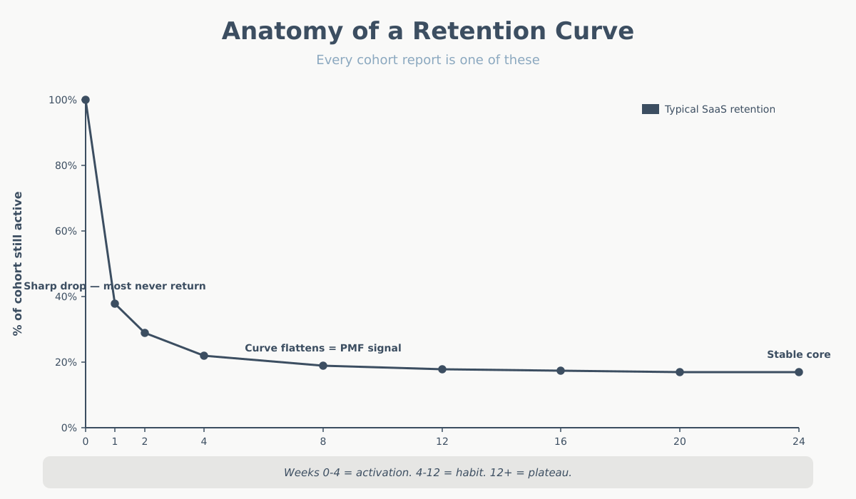
One nuance that trips people up: the first data point is often misleading. Week 0 includes the session when the user arrived, so it’s always 100% and tells you nothing. The real story starts at week 1 (or day 1, or whatever your second bucket is). I sometimes strip week 0 from the chart entirely when I’m showing it to stakeholders, because the cliff from 100% to, say, 35% looks catastrophic and isn’t informative. The shape of what happens after that first drop is the signal.
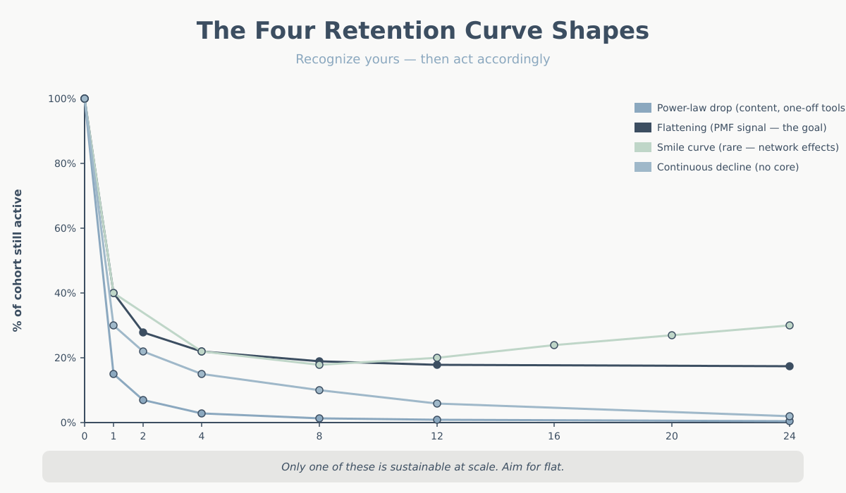
The four retention shapes and what they mean
Retention curves almost always fall into one of four shapes. Recognizing which one you’re looking at is 80% of cohort analysis.
1. Power-law drop
The curve falls steeply from 100% to single digits within a few weeks, then effectively flatlines near zero. Week 1 might be 15%, week 2 might be 7%, week 4 might be 3%, week 12 might be 1.5%.
This is the most common shape on the open web. Blogs, news sites, one-off tool pages, SEO landing pages for informational queries — anywhere people search for an answer, get it, and leave. It’s not necessarily bad. It’s the normal shape for content-driven sites that don’t need a return visit. If you run a recipe blog, users arrive via Google, read, bookmark or don’t, and leave. That’s fine. Monetization in this model is about volume, not retention.
The mistake is to run a product business on this curve and think it’s working. If you sell a SaaS subscription and week 4 is at 3%, you have a very expensive acquisition engine and a leaky bucket.
2. Flattening curve
The curve drops, but then it stabilizes. Week 1 might be 40%, week 4 might be 22%, week 12 might be 19%, week 24 might be 18%. The key feature is that after the initial drop, the curve goes flat — or nearly flat.
This is the shape of product-market fit. It means you have a group of users who integrated the product into their lives and are not going to leave casually. They found the thing valuable. They kept using it. Every new cohort adds a layer to that stable base, which is how you build a durable business.
A flattening curve with a long plateau is the single most important signal in analytics. If you see it, the strategic question is no longer “do people want this?” — it’s “how do we get more of them, and how do we make the initial drop less severe?”
3. Smile curve
The curve drops, flattens, and then rises. Week 1 is 40%, week 8 is 18%, week 20 is 24%, week 40 is 31%. Users who survive the first few weeks keep coming back more often, and dormant users get reactivated.
This shape is rare. It shows up in products with strong network effects (users come back because their social graph is here — classic examples are Facebook in the early years and some marketplaces), products with strong habit loops (fitness apps, language learning, dating apps during peak usage windows), and products where value compounds the longer you stay (notes apps, CRMs with accumulated data).
If you have a smile curve, you have something extraordinary. Most products never get one. Don’t expect it. If you see it, invest heavily in the mechanisms that produce it — usually some form of stored value (data, relationships, content) that users cannot easily rebuild elsewhere.
4. Continuous decline
The curve drops and keeps dropping. No plateau, no stability. Week 1 is 30%, week 4 is 15%, week 12 is 6%, week 24 is 2%. Slower than a power-law drop, but no floor.
This is the worst shape for a product business, because it means you have no core of stuck users. Everyone leaves eventually. It’s common in products that solve a transient need (wedding planners after the wedding, tax software after tax season — but those are expected to decline and can still be profitable). It’s dangerous when it’s unexpected — a B2B tool that users churn out of continuously means there’s no actual dependency being built.
What “active” should mean in your retention curve
The retention curve is only as useful as your definition of “active”. And most people use the wrong one.
The default in analytics tools is “had a session”. That’s almost never the right definition. A user who opened your homepage, saw the logo, and bounced is not retained in any meaningful sense. You need to define active as a behavior that correlates with value received.
Some practical definitions by vertical:
- SaaS: performed a core action (not just logged in). For a project-management tool, “created or updated a task”. For a writing app, “saved a document of more than N words”. Logging in without doing anything is not active.
- E-commerce: “viewed at least one product page” for top-of-funnel retention, or “added to cart” for mid-funnel, or “purchased” for bottom-funnel. Three different curves, three different stories. I usually plot all three.
- Content sites / blogs: “read more than one article in the session” or “returning visitor who engaged with new content published since their last visit”. Just returning is not the signal — returning to consume new output is.
- Marketplaces: depends on the side. For the demand side, “completed a search” or “contacted a supplier”. For the supply side, “listed an item” or “responded to a message”.
- Mobile apps: the industry default is “opened the app”, which is weak. Stronger: “completed the onboarding”, “triggered the aha-moment event”, or “used feature X”.
Picking a meaningful active definition is the single biggest lever on whether your cohort report tells you the truth. If you use “had a session”, you’ll overstate retention and miss the real signal. If you use “made a purchase” on a site with a 90-day buying cycle, you’ll understate it. Match the definition to the natural cadence of value delivery.
Weekly vs. monthly retention curve cohorts
The time bucket matters more than people realize. Daily, weekly, and monthly cohorts tell different stories and are appropriate for different products.
Weekly cohorts are the default I reach for in most cases. Weekly cycles match how people plan work, use tools at their jobs, and consume media. Weekly buckets are granular enough to see churn dynamics within the first month (the critical window for most products), and stable enough that you’re not looking at random daily noise. If your product has any kind of “come back during the week” rhythm, weekly is right.
Monthly cohorts are appropriate for products with long natural cycles: subscription tools billed monthly, e-commerce with a 30+ day buying cadence, enterprise SaaS with monthly check-ins. Monthly cohorts smooth out the noise but hide the crucial first-two-weeks behavior. If your activation window is short, monthly will hide your problem.
Daily cohorts are for high-frequency products — social apps, games, news, anything where users are expected to return every day or two. At daily granularity you can see the day-1 cliff and measure the effect of onboarding changes almost immediately.
A quick rule of thumb: pick the time bucket that matches your expected usage cadence. If the user should be back within a week, use weekly. If the expected cadence is a month, use monthly. Using the wrong granularity makes the curve look either terrifying or pointlessly flat.
Reading the retention curve for PMF signals: three questions
When I open a cohort report, I ask three questions in order.
The broader framing around why retention beats acquisition is worth reading — Reforge’s “silent killer” piece on retention is a useful external reference.
Question 1: Does the curve flatten? Look at weeks 4 through 12 (or whatever your equivalent stable window is). Is the curve plateauing, or is it still dropping? A plateau is the single clearest PMF signal you can get from analytics. No plateau, no PMF — no matter how much the top-of-funnel is growing.
Question 2: Are newer cohorts retaining better than older ones? Stack your cohorts from oldest to newest. If each new cohort sits above the previous one at the same week offset, you’re improving the product. If newer cohorts retain worse, something is going wrong — usually a shift in acquisition quality (cheaper channels bringing less-qualified users) or a product regression. Compare week-4 retention across cohorts; it’s a good single-number summary.
Question 3: Where exactly does the curve drop? If the big drop is between week 0 and week 1, you have an activation problem — users aren’t reaching the aha-moment. Fix onboarding. If the big drop is between week 4 and week 8, you have a habit-formation problem — users get initial value but don’t integrate the product. Fix reminders, second-session hooks, or the product itself. If the drop is gradual across all weeks, you have a core value problem — the product just isn’t valuable enough. No amount of onboarding fixes that.
These three questions cover 90% of what you need from a cohort report. For context on how retention interacts with other core metrics, see key website metrics.
Segmenting the retention curve by acquisition channel
This is where cohort analysis becomes genuinely interesting. A single blended retention curve is a useful summary, but the real insights come from splitting cohorts by where the user came from.
Users acquired through different channels have radically different retention profiles. In my experience with mid-size SaaS and content sites, a typical split looks like this:
- Direct traffic retains best. These are people who knew your brand and came back on purpose. Week-4 retention of 40–55% is not unusual.
- Organic search is usually second. Users had a specific intent, found you, and if the product matches the intent, they stay. Week-4 often 25–40%.
- Email from existing subscribers retains very well, but this is partially circular — they’re already retained, that’s why they’re on the list.
- Paid search is mixed. High-intent keywords retain well; broad-match brand-awareness campaigns retain poorly.
- Paid social is almost always the worst. Users saw an ad, were mildly curious, clicked, and had no strong intent to begin with. Week-4 retention of 5–12% is typical.
- Referral varies wildly depending on the referring site. Traffic from a trusted review site can outperform direct. Traffic from generic listicles is closer to paid social.
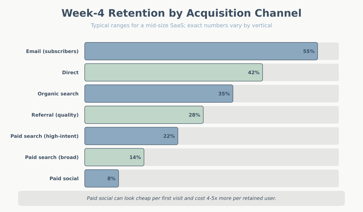
The strategic payoff is obvious once you see the split: acquisition cost on paid social might look fine on a first-purchase basis, but if those users churn at 8% weekly while organic-search users stick at 35%, the true cost per retained user is 4–5x higher. This is the analysis that lets you redirect budget intelligently — and it’s where retention meets attribution modeling. Your attribution model tells you how to credit acquisition; your cohort-by-channel analysis tells you which of those credits were worth the money.
A practical note: you need enough volume per channel for the cohort to be statistically meaningful. A channel bringing in 12 users per week will produce noisy cohorts that tell you nothing. As a rough floor, I want at least 200–300 users per channel per cohort before I take the curve seriously.
Common cohort-analysis mistakes
I see the same five mistakes over and over when clients first start using cohort reports.
Mistake 1: Using “had a session” as the active definition. Already covered above, but it’s the most common. Users who bounced are not retained. Pick a meaningful action.
Mistake 2: Judging cohorts too early. A cohort from last week has one week of data. You cannot tell yet whether it will plateau or keep dropping. Stakeholders love to point at the newest cohort and panic. Wait until the cohort has at least enough history to answer your retention question — usually 8–12 weeks for weekly cohorts.
Mistake 3: Comparing cohorts of different sizes without adjusting. If your January cohort has 500 users and your February cohort has 5,000 (you ran a big campaign), the shapes may differ for reasons that have nothing to do with the product. Big campaigns often bring lower-intent users. Adjust your expectations, and split the campaign cohort from the baseline if you can.
Mistake 4: Confusing retention with engagement depth. A flat retention curve is a PMF signal only if “active” is a meaningful bar. You can have a flat curve where users return weekly to perform a trivial action. That’s technically retention but not meaningful. Pair your curve with an engagement-depth metric — see bounce rate vs. engagement rate for how depth ties back to GA4 definitions.
Mistake 5: Looking only at the blended curve. The blended curve is an average across channels, campaigns, personas, and plans. It’s mathematically correct and strategically useless. Always segment — at minimum by channel, ideally by plan or persona too.
A mini case: reading a real SaaS retention curve
Let me walk through an interpretation of a realistic weekly cohort for a small B2B SaaS tool:
| Week since signup | % of cohort still active |
|---|---|
| Week 0 (signup week) | 100% |
| Week 1 | 40% |
| Week 2 | 28% |
| Week 4 | 22% |
| Week 8 | 19% |
| Week 12 | 18% |
Here is how I would read this, question by question.
Does the curve flatten? Yes. Between week 4 (22%) and week 12 (18%), the curve only lost 4 percentage points across 8 weeks. The slope between week 1 and week 4 was -4.5 points per week; between week 4 and week 12 it’s -0.5 points per week. That’s a clear flattening. This is a PMF-positive signal. There is a core of users who stuck.
Where does the drop happen? The brutal drop is between week 0 and week 1 (100% to 40%) and between week 1 and week 4 (40% to 22%). That’s 78 of the original 100 users gone in the first month. The problem is not in weeks 4–12 — it’s in weeks 0–4. This is an activation problem, not a habit problem and not a core-value problem. The 18% who made it past week 4 love the product; the job is to get more users to week 4.
What would I do? I would not invest in re-engagement emails at week 6 (wrong problem). I would invest heavily in the first-week experience: onboarding, time-to-first-value, and reducing friction in the specific action that correlates with week-4 retention. If I can move week-1 retention from 40% to 50%, I’ll almost certainly move week-12 retention from 18% to 22–23%, which in a subscription business is an enormous shift in unit economics.
I would also split this cohort by channel immediately. If the 18% plateau is driven entirely by organic-search users and paid-social users are at 4% at week 12, the real recommendation is to reallocate paid-social spend — the product works, the channel doesn’t.
Conclusion: what to do Monday morning
If you’ve never looked at your retention curve, here is what I’d do this week. First, pick one active definition that reflects real value for your product — not “had a session”. Second, build one weekly cohort view for at least the last 12 weeks. Third, overlay cohorts and look at the shape. Fourth, split by acquisition channel and compare the curves. Fifth, pick the biggest drop on the curve and decide which of the three problems you have: activation, habit formation, or core value.
The retention curve won’t solve anything on its own. It will, however, tell you the truth about your product. Most other analytics artifacts are optimizable distractions. The curve is the scoreboard. Start there, and work backward into the numbers that actually move it.