Where Are We Losing Buyers? Funnel Leak Analysis Step-by-Step
Funnel leak analysis is the job every analyst or founder eventually has to do. Traffic is climbing, ad spend is doing its job, the top of the funnel looks healthy — and yet revenue barely moves. Something between the visit and the checkout is eating your growth. That is the moment funnel leak analysis stops being theoretical and starts being the work.
I’ve seen teams burn three months on a homepage redesign when the actual leak was a broken address validator on the shipping page. I’ve seen others A/B-test a CTA color while 70% of their mobile users never made it past the product listing. The diagnostic work — figuring out where the funnel actually leaks — which is what funnel leak analysis gives you — is where most of the conversion gains hide. Not in ideas. In measurement.
This article is a method, not a tool tutorial. We’ll walk through how to think about funnel leak analysis drop-offs: how to define them, measure them, segment them, and prioritize fixes by dollar value. By the end you’ll have a repeatable process you can apply to an e-commerce checkout, a SaaS signup flow, or a lead-generation form.
What funnel leak analysis actually covers (and what it doesn’t)
The word “funnel” has been stretched by marketers into something almost meaningless. It usually shows up as a pretty pyramid in a deck: Awareness → Consideration → Purchase → Loyalty. That’s a customer lifecycle diagram. It’s not a funnel you can run a funnel leak analysis on.
A funnel that supports funnel leak analysis is a specific, ordered sequence of events where each step is a prerequisite for the next. A user cannot reach step 3 without completing steps 1 and 2. That constraint is what makes the drop-off numbers meaningful — you’re measuring actual sequential behavior, not vibes.
A funnel isn’t:
- A sales playbook. “Lead → SQL → Opportunity → Closed Won” is a CRM pipeline. Users don’t move through it on a page; sales reps move them through it in meetings. Useful, but a different analysis.
- A user journey map. Journeys branch. Funnels don’t. If your diagram has three paths through the middle, you have three funnels, not one.
- Every page a user visits. A funnel is the minimum required path. If “pricing page” is helpful but not required to purchase, it’s not a funnel step — it’s an enrichment event you segment on.
Once you internalize this, the question “where is my funnel leaking” becomes answerable. Before that, it’s a vibe.
Pick the right funnel view for your funnel leak analysis
Most analytics failures start with choosing the wrong altitude. You can’t diagnose a leak if your funnel is either too zoomed out to show the problem or too zoomed in to show the impact.
A macro funnel is the business-level view. For e-commerce that’s usually: session → product view → add to cart → begin checkout → purchase. For SaaS: landing page → signup → activation → paid. Five or six steps, maximum. This is the funnel you present to stakeholders and watch weekly.
A micro funnel is page-level or interaction-level. Inside “begin checkout → purchase” there might be: email entered → shipping address valid → shipping method chosen → payment method chosen → order review → order placed. You only build a micro funnel after the macro funnel has told you which step to investigate.
In practice there are three flavors worth separating:
- Acquisition funnel — from first impression to first meaningful action (session start → engaged session → first event of value). Leaks here usually point to traffic quality or landing page fit. Related reading: Bounce Rate vs Engagement Rate in GA4.
- Activation funnel — from account or session to “aha moment.” For a SaaS tool this might be signup → project created → first report viewed. For a newsletter: visit → email entered → email confirmed → first open.
- Purchase funnel — the classic money funnel. Category → product → cart → checkout → order. Every step has measurable drop-off and measurable revenue per entrant.
Always diagnose the macro first. I’ve watched teams spend weeks optimizing a cart page when the real leak was at acquisition — 80% of their paid traffic bounced before viewing a single product.
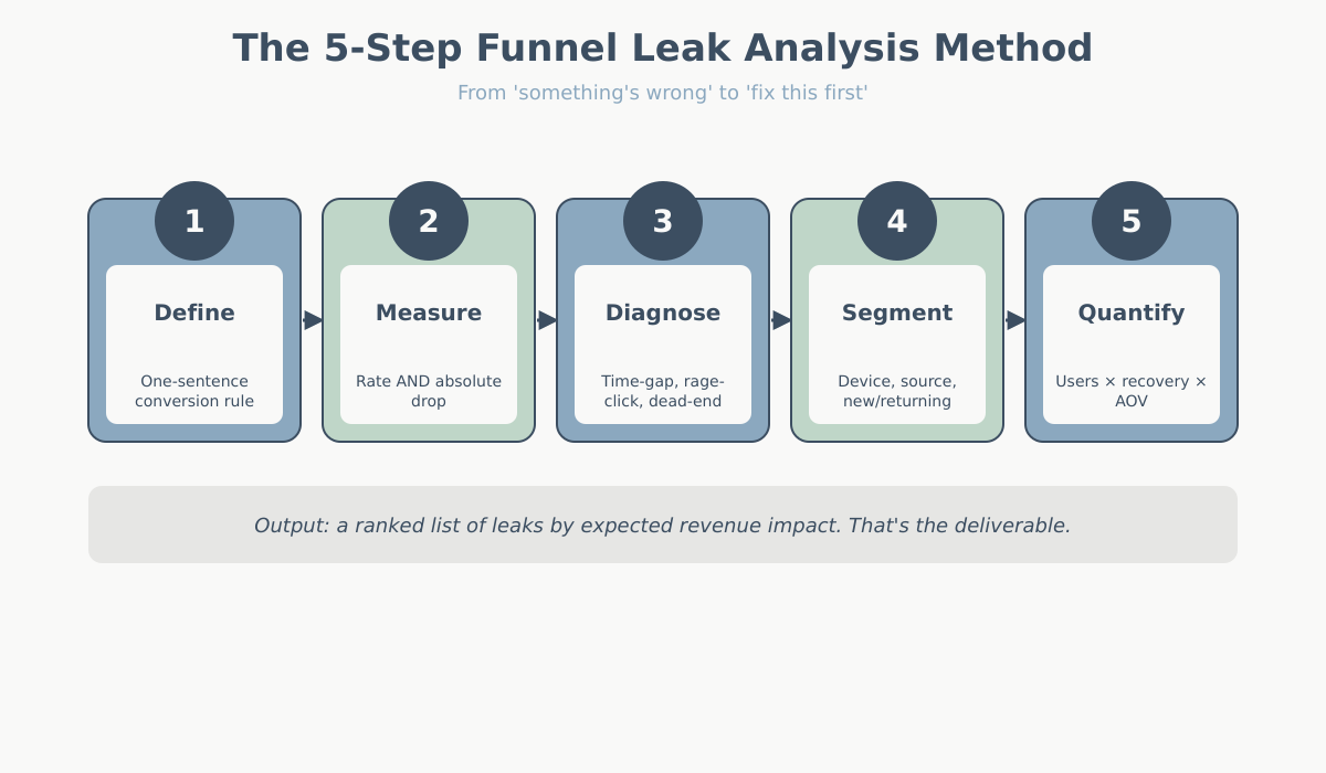
Step 1: Define the conversion event clearly
Before you measure drop-off, you have to know what “conversion” even means. This sounds obvious. It isn’t. Ambiguous conversion definitions are the most common reason funnel numbers contradict the finance spreadsheet.
Here are the edge cases that quietly corrupt conversion tracking:
- Refunds and cancellations. Does your purchase event fire on order placement, on payment authorization, or on order fulfillment? If a user completes checkout but cancels within 10 minutes, did they convert? Most analytics platforms will still count them. Your CFO won’t.
- Guest checkout vs account checkout. These are often different code paths, different events, and sometimes different funnel steps entirely. If your analyst only tracks the logged-in path, 40% of your buyers might be invisible.
- Subscription upgrades and downgrades. Is moving from free to paid a conversion? What about monthly to annual? What about a reactivated canceled account? Pick one rule and document it.
- Multi-item carts. One order with five line items is one purchase event. But if you’re measuring product-to-cart conversion, are you counting it as one add-to-cart or five?
- Partial fills. Lead forms where some fields are optional. Did the user “complete” the form if they skipped the phone number?
Write the definition down in one sentence. Put it next to the dashboard. Every funnel leak analysis disagreement traces back to two people using the word “conversion” differently.
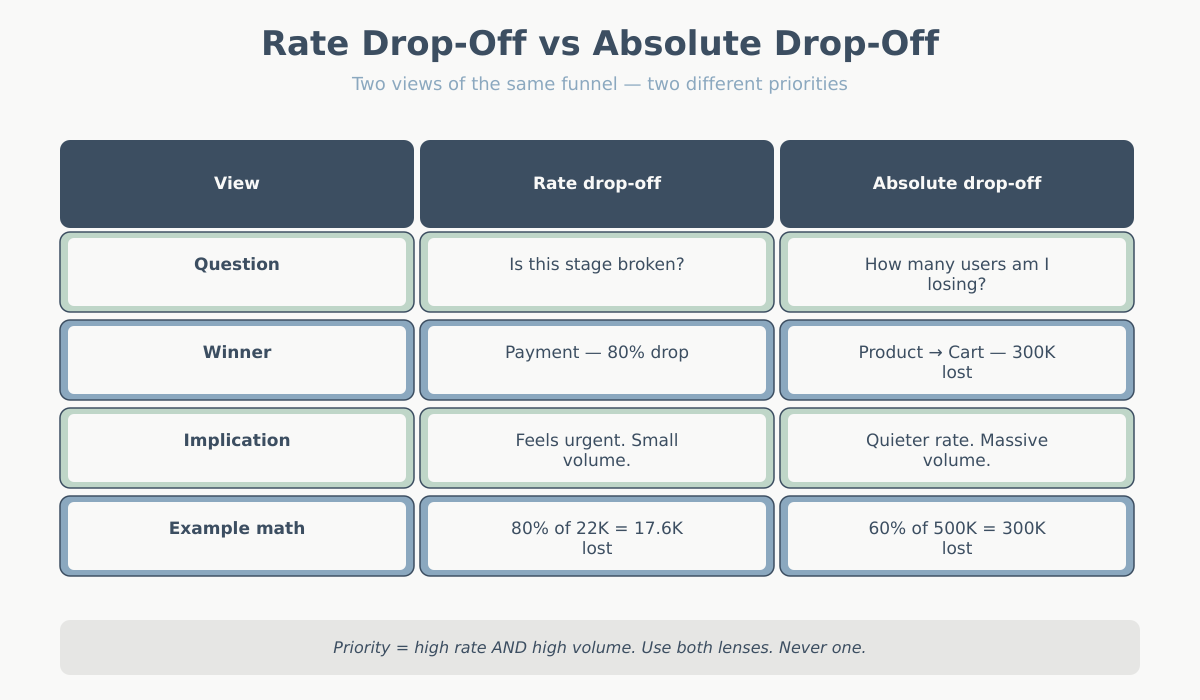
Step 2: Measure absolute drop-off vs rate drop-off
This is the single most important concept in funnel leak analysis, and it’s where most juniors (and plenty of seniors) go wrong.
Rate drop-off is the percentage of users who fail to advance from one step to the next. Absolute drop-off is the raw count of users you lost.
They tell very different stories. Consider this funnel:
| Step | Users entering | Users advancing | Rate drop-off | Absolute drop-off |
|---|---|---|---|---|
| Product page view | 500,000 | 200,000 | 60% | 300,000 |
| Add to cart | 200,000 | 60,000 | 70% | 140,000 |
| Begin checkout | 60,000 | 25,000 | 58% | 35,000 |
| Shipping info | 25,000 | 22,000 | 12% | 3,000 |
| Payment | 22,000 | 4,400 | 80% | 17,600 |
| Order placed | 4,400 | 4,400 | — | — |
Look at the rates. Payment is the worst at 80% drop-off. Alarm bells. Someone books a meeting about fixing the payment page.
Now look at the absolutes. Product page → add to cart lost 300,000 people. Payment step lost 17,600. Fixing payment moves a smaller number of users by definition — the stage is too deep in the funnel to affect volume.
Neither view is “right.” They answer different questions:
- Rate drop-off answers: “Is this stage unusually broken compared to benchmarks or compared to itself last month?”
- Absolute drop-off answers: “If I fix this, how many more orders do I get?”
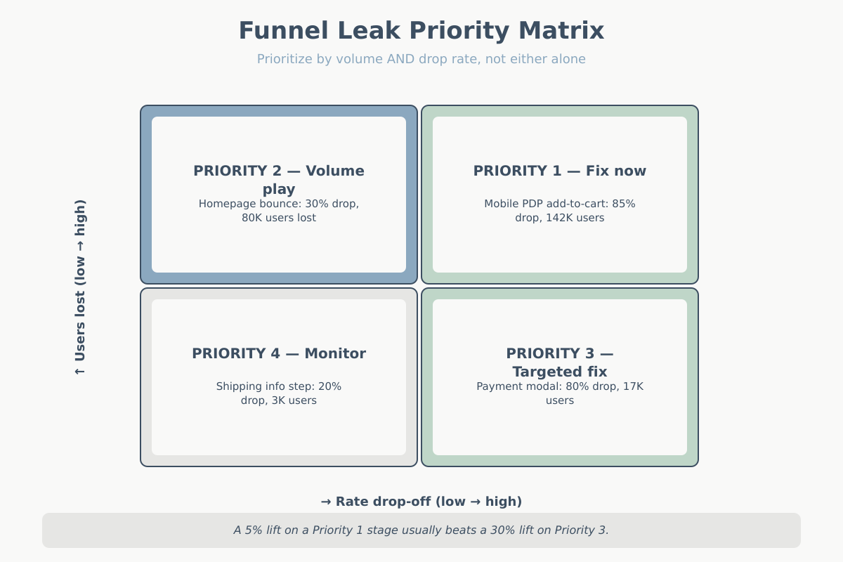
You need both. A stage with high rate drop-off AND high absolute volume is your top priority. A stage with high rate drop-off and tiny volume is a small fix. A stage with low rate drop-off but huge volume might still move the business more than a dramatic fix elsewhere.
Step 3: Find the suspect stages
Knowing a stage leaks tells you nothing about why. Step 3 is converting “this stage drops 60%” into a testable hypothesis about user behavior. You don’t need expensive tools for this — you need three proxy signals.
For the checkout step specifically, Baymard Institute’s checkout usability research is the most cited external benchmark for expected drop-off rates and common UX causes.
Time-gap analysis
For every step, measure the median time between entering the step and advancing (or exiting). A stage where most users advance in under 15 seconds and a small tail takes 4+ minutes usually has a visible failure mode: a broken field, a confusing form, a loading delay. A stage where everyone takes 90+ seconds is doing real cognitive work — compare browsing a listing page to filling out shipping info.
The tell: if time-to-exit on a stage is dramatically longer than time-to-advance, users are struggling before giving up. That’s not a CTA problem. That’s a form problem, a pricing-shock problem, or a trust problem.
Rage-click and rage-scroll proxies
Even without a dedicated session replay tool, you can approximate frustration signals from event data. Multiple clicks on the same element within 2 seconds, rapid scroll-up-scroll-down patterns, repeated submit attempts — all of these are events you can fire and count per stage. A stage with 3x the rage-click rate of the funnel average has a UX problem, usually a button or field that isn’t behaving the way users expect.
Dead-end detection
A dead-end is a page users land on and exit without interacting. Not a bounce in the top-of-funnel sense — a mid-funnel dead-end is worse because the user already committed. Look for pages where the ratio of (events fired) to (pageviews) is close to zero. Usually it’s a broken state: an error page that isn’t instrumented as an error, a validation failure rendered as a pageview, a redirect loop, a step that requires JavaScript that didn’t load.
Combine the three and you have a short list of specific stages with specific hypotheses. That’s what Step 4 will segment.
Step 4: Segment the leak
Aggregate funnels lie. They smooth out problems that are catastrophic for one segment and invisible in another. Every real leak I’ve found lived in a segment.
Start with the segmentations that cost nothing to pull:
- Device. Mobile vs desktop vs tablet. If mobile checkout converts at a third of desktop, the issue is almost always form usability, viewport, or payment method availability (Apple Pay / Google Pay missing on mobile is a classic).
- New vs returning user. If new users drop 3x harder at a specific step, you probably have a trust or education problem at that step — returning users already cleared it once and know what to expect.
- Traffic source. Paid social vs organic search vs email. This one is critical and undersegmented. I’ve seen a funnel where Facebook traffic converted at 0.3% and Google organic at 3.1% — the Facebook traffic wasn’t broken, the ad creative was promising something the landing page didn’t deliver. See Attribution Models in Web Analytics and UTM Parameters Explained for how to trace this cleanly.
- Geography. International users hitting a checkout that only accepts domestic cards. Currency display issues. Shipping restrictions that reveal themselves only after 5 minutes of form-filling.
- Browser and OS. Usually not the answer, but worth a quick scan. A specific iOS version breaking your payment modal is a real, recurring pattern.
- Time of day / day of week. Often a symptom of infrastructure — checkout slowing under peak load looks like a funnel leak.
The goal isn’t to find one magic segment. It’s to check whether the aggregate 60% drop-off is really “60% across everyone” or “20% for desktop returning users and 85% for mobile first-time paid-social visitors.” Those are two completely different problems with two completely different fixes.
Step 5: Funnel leak analysis — quantify the value of each leak
Here’s where most funnel leak analysis work stops — with a pretty chart showing drop-offs but no prioritization. The last move is converting each leak into dollars.
The formula is simple but worth writing out:
Value of fixing a leak = (users lost at stage) × (realistic recoverable %) × (downstream conversion rate) × (average order value or LTV)
Each factor matters:
- Users lost at stage — your absolute drop-off number from Step 2.
- Realistic recoverable percentage — not 100%. If industry benchmark drop-off at this stage is 40% and you’re at 60%, the recoverable ceiling is maybe 20 percentage points, not the full 60. Be honest about this; most fixes capture 10-30% of the gap.
- Downstream conversion rate — of the users you save, what fraction will complete the remaining steps? Multiply the per-stage rates from your funnel table.
- Value per conversion — AOV for e-commerce, expected LTV for subscription, lead-to-deal value × close rate for B2B. See Key Website Metrics for how to get these numbers defensibly.
Worked example. Suppose the product-page → add-to-cart stage drops 300,000 users. We think we can recover 10% (30,000 users). Downstream conversion from add-to-cart to purchase is 2.2% (4,400 / 200,000). AOV is $85.
Value = 30,000 × 2.2% × $85 = $56,100/month
Now do the same for the payment stage. Drops 17,600. Recoverable maybe 25% (payment page fixes often have higher recovery because they’re more targeted). Downstream conversion is 100% (payment is the last step). AOV $85.
Value = 17,600 × 25% × 100% × $85 = $374,000/month
The payment page — despite losing far fewer users in absolute terms — is worth more than six times as much to fix, because recovery at that stage is cleaner and there’s no downstream funnel to dilute the saved users.
This is why you do the quantification. Without it you’ll chase the largest leak on the chart. With it you chase the most valuable one.
A real-world walkthrough
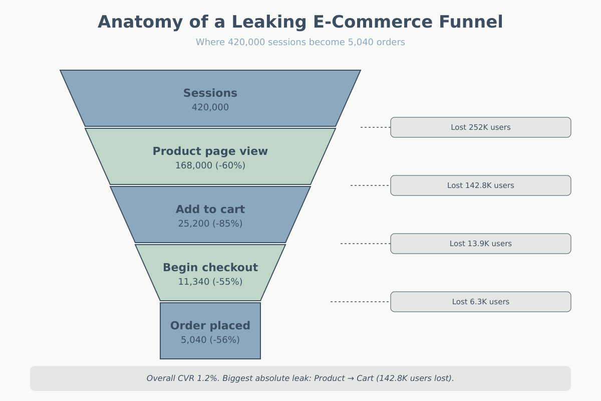
Let me make this concrete with a plausible example. An apparel e-commerce site, $6M annual revenue, overall conversion rate 1.2%. Traffic is flat-to-growing, revenue is flat. They think checkout is broken because “95% of people who start checkout don’t finish.” They want to A/B test the checkout button color.
Here’s their macro funnel for a typical month:
| Stage | Users | Rate from prior | Rate drop |
|---|---|---|---|
| Sessions | 420,000 | — | — |
| Product page view | 168,000 | 40% | 60% |
| Add to cart | 25,200 | 15% | 85% |
| Begin checkout | 11,340 | 45% | 55% |
| Shipping complete | 9,072 | 80% | 20% |
| Payment attempt | 6,350 | 70% | 30% |
| Order placed | 5,040 | 79% | 21% |
The stakeholder claim — “95% of people who start checkout don’t finish” — is mathematically wrong. 11,340 begin checkout, 5,040 complete. That’s 56% completion, not 5%. They were comparing order count to sessions, which is a different metric. Step 1 (clear definitions) already saves us weeks.
Real analysis:
- Absolute drop-off ranking: Sessions → Product (252,000 lost), Product → Cart (142,800 lost), Cart → Checkout (13,860), Checkout → Shipping (2,268), Shipping → Payment (2,722), Payment → Order (1,310).
- Rate drop-off ranking: Product → Cart (85%), Session → Product (60%), Cart → Checkout (55%), Shipping → Payment (30%), Payment → Order (21%), Checkout → Shipping (20%).
- Top suspect: Product → Cart. High volume AND high rate. This is where the money is hiding, not the payment page.
Segmenting the Product → Cart stage by device:
| Device | PDP views | Add to cart | Rate |
|---|---|---|---|
| Desktop | 58,800 | 14,112 | 24% |
| Mobile | 100,800 | 10,080 | 10% |
| Tablet | 8,400 | 1,008 | 12% |
Mobile adds to cart at less than half the desktop rate. Mobile is 60% of PDP traffic. If mobile hit desktop’s 24% rate, we’d see an extra 14,112 adds to cart — roughly doubling the top of the checkout funnel.
Time-gap analysis on mobile PDPs shows median time-to-exit of 42 seconds with no scroll past the hero image on 38% of sessions. Rage-tap rate on the size selector is 4x the site average.
Hypothesis: the mobile PDP size selector is broken or confusing. Users try, fail, leave. Fix would be a redesign of the size-selection component.
Value math for this fix:
- Recoverable users per month: realistic 8,000 extra add-to-cart (about half the theoretical max)
- Downstream to purchase: 5,040 / 25,200 = 20%
- Saved orders: 8,000 × 20% = 1,600/month
- AOV: $72
- Incremental revenue: 1,600 × $72 = $115,200/month, or about $1.38M/year
Meanwhile the checkout-button color test, at a generous 5% lift on order-placed conversions: 5,040 × 5% = 252 extra orders × $72 = $18,144/month. Real money, but one-tenth of what’s bleeding out of the mobile PDP.
The team’s instinct was wrong in two ways: they misread the funnel math, and they were looking at the wrong stage even if the math had been right.
Common funnel leak analysis traps
Five ways a funnel leak analysis goes sideways, in my experience roughly ranked by frequency:
- Ratio blindness. Looking only at rates, ignoring absolute volumes. You’ll obsess over a 90%-drop stage that only 200 users enter while ignoring the 50%-drop stage feeding 400,000 users.
- Aggregate-only analysis. Reporting on the average user. The average user doesn’t exist. If you haven’t segmented by device, source, and new-vs-returning, you haven’t finished the analysis.
- Funnel-step misordering. Building a funnel where a step isn’t actually required for the next. E.g., treating “view sizing guide” as a step before “add to cart” when 80% of buyers skip it. The reported 80% drop at that step is a measurement artifact, not a real leak.
- Ignoring time windows. Users don’t complete funnels in a single session. A B2B prospect might revisit the pricing page seven times over three weeks before converting. If your funnel is session-scoped, you’re undercounting conversion massively and overcounting drop-off at every stage.
- Optimizing the last step first. Humans are drawn to the stage nearest the money. But the earlier in the funnel you fix something, the more users it benefits. A 5-point improvement at step 1 beats a 20-point improvement at step 5 almost every time on volume alone.
Conclusion
Funnel leak analysis is a sequence, not a dashboard. Define the conversion event unambiguously. Measure both rate and absolute drop-off. Use time-gap, rage, and dead-end signals to generate hypotheses about why. Segment the leak until the aggregate view dissolves into specific broken experiences. Quantify each leak in dollars before committing engineering time.
Do this once properly and you’ll have a short list — usually three or four stages — worth fixing, ranked by expected revenue impact. That list will be more useful than a year of gut-feel optimization. And the next time someone proposes a homepage redesign to “fix conversion,” you’ll have the numbers to point at the actual problem instead.