Bounce, Engagement & Conversion Rate Benchmarks by Industry
Web analytics benchmarks are the most forwarded, least understood numbers in marketing. Every quarter someone sends me a chart claiming “the average conversion rate in our industry is 2.35%” and asks whether our site is doing well. Fair question, frustrating answer: the headline number on that web analytics benchmarks chart is probably right, and it’s probably useless for your specific situation.
Web analytics benchmarks are useful when they tell you whether you’re in the right neighbourhood. They become dangerous when teams treat them as targets, copy them into OKRs, or use them to justify decisions that don’t match their own traffic mix. I’ve watched a SaaS company spend six months trying to push engagement rate from 48% to the “industry standard” 62% without realising the benchmark they chased was built mostly from consumer blogs.
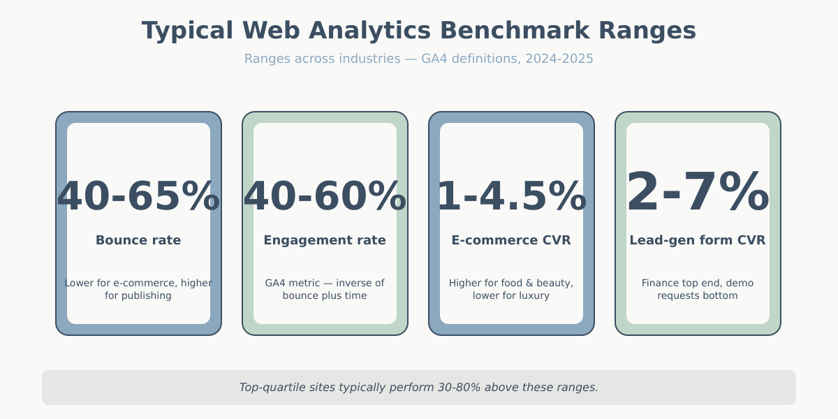
This article does two things. First, it gives you realistic ranges for bounce rate, engagement rate, conversion rate, session duration, and pages per session across the industries I see most often. Second, it explains how to read those ranges without getting fooled by them.
A quick warning before we go any further. The ranges you’ll see below are wider than the single-point averages you find on most blog posts, and that’s deliberate. A “2.3% conversion rate” stated to two decimal places gives the illusion of precision that real data rarely supports. Your mileage will vary based on your audience, price point, offer, season, and traffic mix. Treat every number below as a neighbourhood, not an address.
How to read web analytics benchmarks correctly
Before the tables, a few definitions. Tools disagree on the fine print, and that matters when you’re comparing your numbers to someone else’s.
If you want an external sanity check, Contentsquare’s annual digital experience benchmark is one of the better-methodology sources — they disclose sample size, vertical, and weighting.
Bounce rate in Universal Analytics meant a session with exactly one pageview. GA4 replaced it with engagement rate: the share of sessions that lasted at least 10 seconds, triggered a conversion event, or had two or more pageviews. Bounce rate in GA4 is simply 1 minus engagement rate, so a 55% engagement rate equals a 45% bounce rate. If you need a refresher, see the bounce rate vs engagement rate breakdown.
Conversion rate means different things depending on context. E-commerce sites usually measure it as completed orders divided by sessions. Lead-gen sites measure submitted forms divided by sessions, or sometimes divided by unique visitors. SaaS teams often blend free-trial starts, demo bookings, and paid conversions, which makes cross-company comparison nearly impossible.
Session duration only counts time between events in most tools, so a reader who spends eight minutes on a single page with no scroll events may register as a five-second session. GA4’s engaged session time is a better signal than average session duration in almost every case.
When you look at web analytics benchmarks, ask three questions. What’s the sample size (10 sites vs 10,000)? What’s the date window (pre-iOS 14.5 traffic behaves very differently from 2025 traffic)? And how did they handle bot filtering and sampled data? Numbers drawn from 500 small Shopify stores on mobile will look nothing like numbers drawn from 50 enterprise B2B sites.
There’s a fourth question I ask before trusting any web analytics benchmarks: how was the metric actually computed? Two studies both reporting “average CVR” can measure different things. One might use all sessions as the denominator; another might strip out bounces first. One might count a view of the order-confirmation page; another might pull from the order database and match back via client ID. The headline number can differ by 50% depending on those choices.
The other thing worth noting: most public web analytics benchmarks reports draw disproportionately from small and mid-market sites because that’s where their customer base sits. Enterprise sites with eight-figure traffic rarely participate in public studies. So when you read “industry average CVR is 2.1%,” that 2.1% is the average across thousands of small-to-mid sites, not the weighted-by-revenue average. The biggest brands in any category usually perform well above that line.
Bounce and exit rate benchmarks by industry
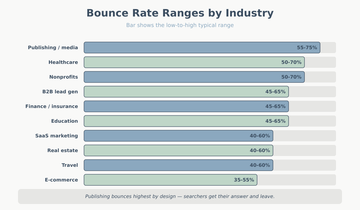
The figures below come from blending aggregate studies I trust and my own client data over the last three years. They’re ranges, not single numbers, and they assume GA4 definitions unless noted. If you’re still on UA-era bounce rate, expect your numbers to sit 10 to 20 points higher than the GA4 equivalents.
| Industry | Typical bounce rate | Exit rate (content pages) | Notes |
|---|---|---|---|
| E-commerce (general) | 35-55% | 25-40% | Product pages lowest, category highest |
| SaaS marketing sites | 40-60% | 30-45% | Pricing page exits are normal |
| Publishing / media | 55-75% | 50-70% | Search traffic bounces hard by design |
| B2B lead generation | 45-65% | 35-55% | Whitepaper landing pages run higher |
| Real estate | 40-60% | 30-50% | Listing pages vary by inventory depth |
| Finance / insurance | 45-65% | 35-55% | Comparison searches inflate bounces |
| Healthcare | 50-70% | 40-60% | Symptom-answer pages bounce quickly |
| Education | 45-65% | 35-55% | Course pages lower, blog higher |
| Travel | 40-60% | 25-45% | Search-to-listing flows reduce bounce |
| Nonprofits | 50-70% | 40-60% | Donation pages behave like e-commerce |
A few patterns are worth calling out. Publishing sits at the high end because most traffic is one-and-done from search or social — that’s the business model, not a problem to fix. E-commerce sits at the low end because shoppers almost always browse more than one page before making up their minds. B2B lead gen varies wildly depending on whether you count gated-content landing pages, which are built to convert on the first screen and naturally bounce.
Healthcare is a category that trips people up constantly. Informational pages — symptom descriptions, medication side effects, condition overviews — get enormous search traffic from people who want one specific answer and then leave. That’s a 65-75% bounce rate and a fully healthy content strategy. The same healthcare company’s appointment-booking flow will look totally different, maybe 35% bounce. Reporting a single blended bounce rate for a healthcare site hides everything that matters.
Exit rate is the quieter cousin of bounce rate. It measures what percentage of sessions ended on a given page, regardless of how many pages came before it. High exit rates on a thank-you page or a product-delivered page are expected. High exit rates on the middle of a checkout flow are a five-alarm fire. When you’re diagnosing a problem, exit rate on a per-page basis is often more useful than aggregate bounce rate.
Engagement rate benchmarks by industry (GA4)
Engagement rate is the inverse of bounce rate in GA4, plus a time threshold and an event trigger. The 10-second threshold is forgiving, which is why you’ll see engagement rates that look higher than the old UA “non-bounce” numbers for the same traffic.
| Industry | Typical engagement rate | Top-quartile engagement rate |
|---|---|---|
| E-commerce (general) | 50-65% | 65-75% |
| SaaS marketing sites | 45-60% | 60-70% |
| Publishing / media | 35-50% | 50-65% |
| B2B lead generation | 40-55% | 55-70% |
| Real estate | 45-60% | 60-75% |
| Finance / insurance | 40-55% | 55-70% |
| Healthcare | 35-50% | 50-65% |
| Education | 40-55% | 55-70% |
| Travel | 45-60% | 60-75% |
| Nonprofits | 35-50% | 50-65% |
The “top-quartile” column is the one worth staring at. It’s where well-optimised sites sit, not where average sites sit. If your engagement rate is right in the middle of the typical band, you’re doing what most of your competitors are doing. If you’re below it, start with traffic quality before touching the landing page.
One habit worth breaking: don’t mix engagement rate and UA bounce rate in the same report. I’ve seen quarterly decks where engagement rate is up year-over-year and the author declares victory, when the comparison was between 2022 UA data and 2024 GA4 data. They’re different calculations. Engagement rate will almost always look better than “1 minus UA bounce rate” on the same traffic because the 10-second threshold catches sessions that UA would have counted as bounces.
Mobile versus desktop is the segmentation most teams forget. Mobile engagement rates typically sit 8-15 percentage points below desktop for the same site. If your traffic went from 40% mobile to 65% mobile over two years — which it probably did — your blended engagement rate dropped for reasons that have nothing to do with the site itself. Always segment by device before concluding anything.
Conversion rate web analytics benchmarks by industry
Conversion rate is where web analytics benchmarks get the most abused. An e-commerce store selling $15 phone cases and one selling $4,000 furniture can’t meaningfully share a CVR target. I split the table into e-commerce checkout CVR and lead-gen form CVR because they’re genuinely different metrics.
E-commerce checkout conversion rate
| Category | Typical CVR | Top-quartile CVR |
|---|---|---|
| Food and beverage | 3.0-5.5% | 5.5-8.0% |
| Beauty and personal care | 2.5-4.5% | 4.5-7.0% |
| Apparel and accessories | 1.5-3.0% | 3.0-5.0% |
| Home and garden | 1.0-2.5% | 2.5-4.0% |
| Consumer electronics | 1.0-2.5% | 2.5-4.0% |
| Luxury and high-ticket | 0.4-1.5% | 1.5-2.5% |
| Sports and outdoor | 1.5-3.0% | 3.0-4.5% |
| Pet supplies | 2.5-4.5% | 4.5-6.5% |
Lead generation form conversion rate
| Industry | Typical form CVR | Top-quartile form CVR |
|---|---|---|
| SaaS — free trial signup | 3-7% | 7-12% |
| SaaS — demo request | 1-3% | 3-5% |
| B2B services | 2-5% | 5-9% |
| Finance / insurance quotes | 3-8% | 8-14% |
| Real estate inquiries | 2-5% | 5-9% |
| Higher education | 3-6% | 6-10% |
| Healthcare appointments | 2-5% | 5-9% |
| Legal services | 2-6% | 6-11% |
Pay attention to the gap between typical and top-quartile. In high-ticket e-commerce the ceiling is low in absolute terms but the best sites roughly double the average. In SaaS free trials the spread is even wider because the top performers combine strong product-market fit with paid-traffic intent. If your numbers trail the typical range, focus on the basics first: page speed, form friction, clarity of the offer. Only then is it worth chasing the top quartile.
For attribution-sensitive categories, remember that last-click CVR and data-driven CVR look very different. A deep dive on this lives in the attribution models overview.
A note on the SaaS numbers. Free-trial signup CVR and demo-request CVR shouldn’t be compared directly — they measure different levels of commitment. A visitor will sign up for a free trial with an email address in twenty seconds. Booking a demo is the same level of commitment as scheduling a dentist appointment. The top-of-funnel metric is always going to look better. What matters for SaaS is the full-funnel conversion from visit to paid customer, which usually lands somewhere in the 0.5-2% range regardless of how the top of the funnel is designed.
High-ticket e-commerce deserves its own mention. A site selling $4,000 custom furniture may see a 0.6% CVR and still be wildly profitable because the revenue per converting session is $50+. Comparing that site to a $15 phone-case shop with a 4% CVR on revenue per session instead of raw CVR usually flips the story. Revenue per session (RPS) is the metric I recommend tracking alongside CVR for any business with significant price variation.
Session duration and pages per session benchmarks
These two are sanity checks, not primary KPIs. They tell you whether visitors are doing something on the site, but they don’t tell you whether that something is valuable. A 12-minute session on a help article might mean confusion, not engagement.
| Industry | Avg session duration | Pages per session |
|---|---|---|
| E-commerce (general) | 2:30-4:30 | 3.0-5.0 |
| SaaS marketing sites | 1:30-3:30 | 2.0-3.5 |
| Publishing / media | 1:00-2:30 | 1.5-2.5 |
| B2B lead generation | 1:30-3:30 | 2.0-3.5 |
| Real estate | 3:00-6:00 | 4.0-8.0 |
| Finance / insurance | 1:30-3:30 | 2.0-4.0 |
| Healthcare | 1:00-2:30 | 1.5-3.0 |
| Education | 2:00-4:00 | 2.5-4.5 |
| Travel | 3:00-6:00 | 3.5-6.0 |
| Nonprofits | 1:00-2:30 | 1.5-3.0 |
Real estate and travel lead on pages per session because visitors compare options extensively before contacting anyone. Publishing stays low because a well-written article often delivers everything the reader wanted in one visit. If you want the canonical definitions for any of these, the analytics glossary covers them.
Average session duration is the metric I trust least. It’s a ratio of total engaged time divided by sessions, and GA4 only records time between events. A reader who opens your article, reads for seven minutes without scrolling or clicking anything, then closes the tab, might register as a zero-second or one-second session depending on how event tracking is set up. If session duration matters to you — which it arguably shouldn’t — add scroll depth tracking and a periodic “engaged ping” so the time math actually reflects reality.
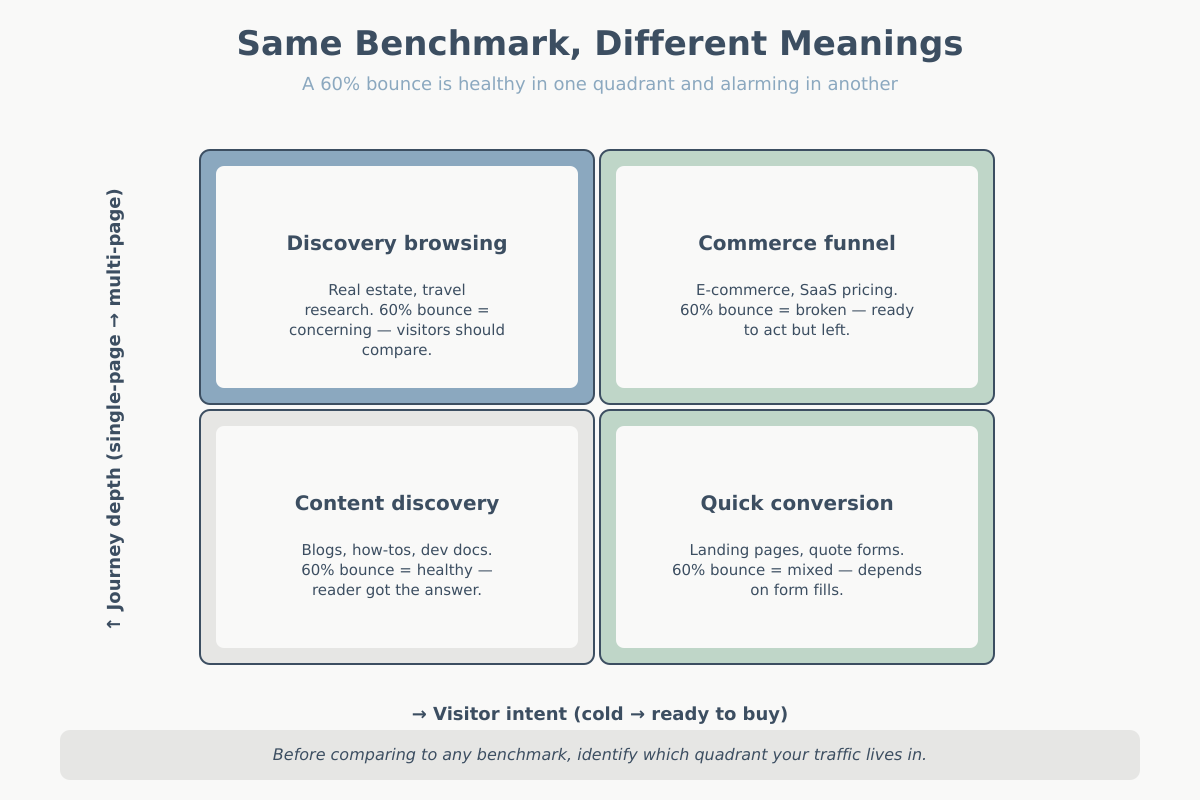
Why the same web analytics benchmarks mean wildly different things
Imagine two sites with a 60% bounce rate. Site A is a developer blog with 80% organic search traffic. Readers land on an article, get the answer, and leave satisfied. Bounce rate is a feature of the experience, not a bug. In this context, 60% is probably the best number the site will ever see.
Site B is a SaaS product page reached mostly through paid search on high-intent keywords. Visitors arrive ready to evaluate. A 60% bounce means most reject the offer in ten seconds. The same benchmark number describes a healthy content operation and a leaking paid-acquisition funnel.
The lesson isn’t that bounce rate is broken. It’s that the traffic composition behind the number matters more than the number itself. Before you compare yourself to industry web analytics benchmarks, break your own traffic down by source, device, and landing page type. I’d rather know bounce rate for “paid search to pricing page” than for “all traffic to all pages.”
The same logic applies to conversion rate. A 3% CVR across 100,000 sessions of mixed traffic tells you less than a 1.2% CVR on cold paid social plus a 6% CVR on branded search. Those two funnels need very different interventions.
Here’s a third example I see often. Two publishing sites both report 2 pages per session. Site A serves heavy evergreen content with a strong internal-link strategy, and the 2 pages per session reflects that readers actually follow those links. Site B serves news articles where people arrive from Google News, read once, and leave. The average is the same; the content strategy implications are opposite. Site A should invest more in internal links; Site B should optimise for ad revenue per page, because the second page isn’t coming.
If you take one thing from this section, let it be this: web analytics benchmarks are statements about a population, and you are working on a sample of one. Applying population statistics to a single site is the exact mistake every statistics textbook warns about on page three.
How to set realistic targets for your site
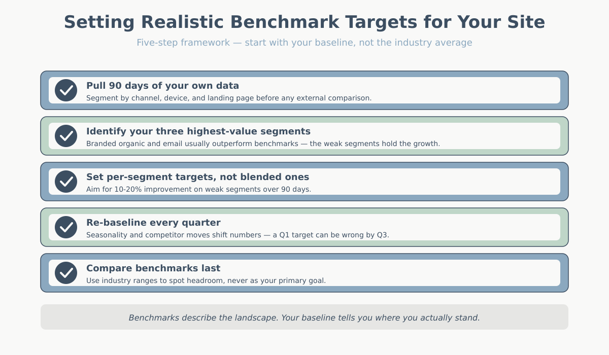
Web analytics benchmarks should be a reality check, not your target-setting framework. The real framework starts with your own baseline.
- Pull 90 days of your own data segmented by acquisition channel, device, and landing page. You need the internal shape of your traffic before external comparisons make sense.
- Identify your three highest-value segments. Usually two of them — maybe branded organic and email — already outperform the industry benchmark by a wide margin. The weak segments are where growth lives.
- Set targets for each segment separately. A realistic 90-day goal is a 10-20% improvement on a weak segment, not “match the industry average across all traffic.”
- Re-baseline every quarter. Seasonality, algorithm updates, and competitor moves all shift the numbers. A target that made sense in Q1 may be wrong by Q3.
- Compare benchmarks last. Once you know your own shape, benchmarks tell you which segments have the most headroom versus peers. That’s where budget and effort should go.
The teams I see succeed are the ones that treat web analytics benchmarks as a map of the landscape, not a scoreboard. You still need to know where you are on your own terrain. For a refresher on which metrics are actually worth tracking, the key website metrics guide covers the shortlist.
Five web analytics benchmarks mistakes teams keep making
1. Treating a single number as the goal. “Our target is a 2.35% conversion rate” skips over the entire question of where the conversions come from. Two sites with identical CVRs can have completely different revenue outcomes.
2. Comparing GA4 numbers to pre-2023 benchmarks. A lot of public benchmark data still mixes UA bounce rate with GA4 engagement rate. They’re not equivalent. If a report doesn’t specify which tool and which year, be sceptical.
3. Ignoring traffic mix. Branded search converts 5 to 10 times better than cold paid social in most businesses. Changing your traffic mix changes your blended CVR without anyone touching the site.
4. Chasing the top quartile too early. If you’re below the typical range, the fastest improvements come from fixing obvious problems: page speed, form length, broken mobile layouts, weak offers. Top-quartile optimisation is a fine endgame, not a starting point.
5. Measuring too small a window. Weekly CVR numbers on sites under 50,000 sessions a month are statistical noise. Use 28-day or 90-day trailing averages before you declare any trend.
A bonus sixth mistake because it’s the one that costs the most money: building the company’s OKRs around benchmark targets. “Raise conversion rate from 1.8% to 2.5% by Q4” looks good in a planning deck and tells the marketing team almost nothing about what to do on Monday morning. Replace it with “identify and fix the top three friction points in paid-social-to-signup by end of Q2, then measure CVR lift on that specific segment.” Specific beats average every time.
Conclusion
Web analytics benchmarks are a useful checkpoint and a terrible target. Use them to confirm you’re in the right neighbourhood and to identify which segments have the most headroom. Then throw the benchmark chart in a drawer and work on your own baseline.
The question isn’t “what’s the average in my industry.” It’s “which specific part of my funnel is underperforming my own 90-day baseline, and what’s the one change most likely to move it?” Answer that well and the benchmark will take care of itself.
When someone asks me “what should our conversion rate be?” the honest answer is always the same: I don’t know yet, and neither do you. We know it after we’ve segmented your traffic, identified which segments are underperforming their own potential, and made a few deliberate changes to close those gaps. That process takes 60 to 90 days on most sites, and it produces a target that actually reflects your business rather than someone else’s average.